Welcome back to my blog! Today I want to write about one of my favorite visualization techniques, the boxplot!
The boxplot, or box and whiskers, is an incredibly useful tool for looking at summary statistics for a given dataset. A very basic boxplot presents the reader with five statistics (the maximum value, the minimum value, the median, and the first and third quartiles) in a compact, easy to read graph. The box, which is defined by the first and third quartiles and split by the median, indicates the range that the middle 50% of the data falls within. The whiskers show the minimum and maximum values. The overall shape allows the reader to easily see where each quarter of the data occurs. All outliers are also indicated by a marker of choice outside the range of the whiskers. This is an extremely helpful feature as it is one of the easist ways to identify outliers. The boxplot ultimately presents a succinct summary of a datset without requiring any additional analysis.
One of the strengths of the boxplot is that it provides a rough estimate of the distribution of the data. A boxplot will imply symmetry if the median evenly splits the box, or a skew if one side of the box is larger than the other. The whiskers also give a basic idea of the tails of the distribution. A long whisker will indicate a long tail. While this won’t give the reader a full grasp of the data’s shape, it allows them to infer the basic distribution.
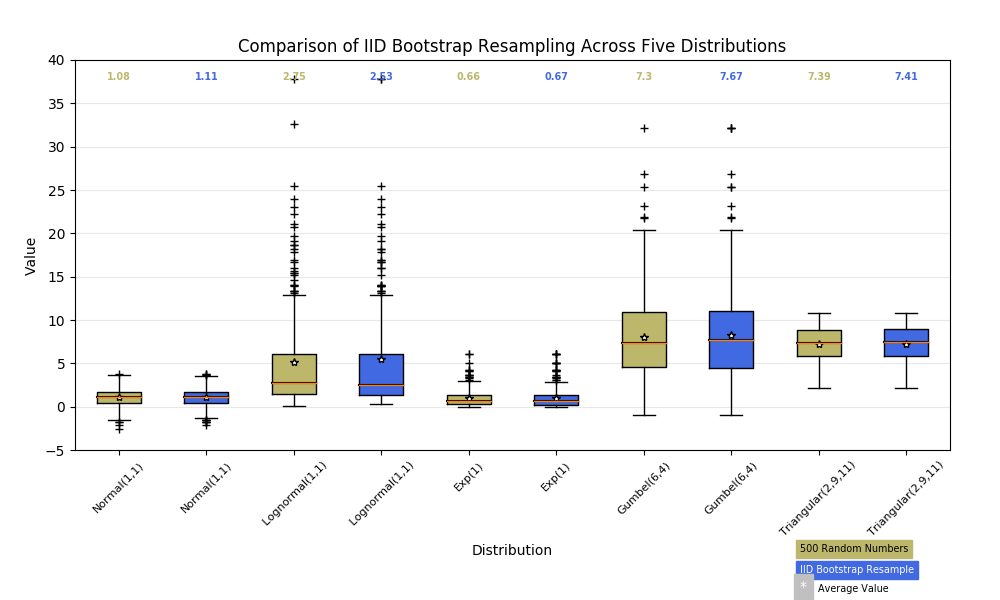
Boxplots are also extremely useful when comparing the statistics of multiple distributions. Since boxplots are so compact, one can easily place multiple plots next to each other on the same chart. This allows the reader to compare the statistics of multiple distributions with nearly the same ease as reading a bar chart. For example, the matplotlib documentation (found here) provides the image below. Using the image, the reader can clearly see which distributions have larger ranges, how close the medians are, and which distributions have lots of outliers. Further, all of this information only takes up the space that one histogram or barchart would take, and we would need ten of those charts to compare all of this information.
While boxplots are incredibly useful tools for comparing summary statistics, they are not useful in every instance. Basic boxplots do not show how many datapoints occupy the same value or even how many datapoints are present in the sample. Because of this limitation, boxplots are not useful for showing the actual shape of a distribution, but instead the rough impression. The boxplot shows how the percentages of the data break down, but doesn’t show how the data is gathered within those percentages. To more effectively see the shape of a distribution, it is better to use a histogram or barchart. To overcome this weakness, it is possible to upgrade the boxplot to a violinplot. A violinplot is a boxplot that shows the shape of the distribution within the box. While this makes the boxplot even more useful, the violinplot still does not convey the number of datapoints at each value, but a preview of the shape of the distribution. Even using the violinplot, the shape of the distribution is still better seen through a histogram.
Another weakness of the boxplot is that it is not a visually impressive graph. In the image above, the boxplots convey a lot of information very effectively, but the graph is very drab and won’t capture interest in the same way that a well-composed barchart or linegraph would. While this is only a cosmetic issue, it is important to understand because the ultimate goal of a visualization is to effectively communicate data. If a reader is uninterested in a visualization, it is not an effective visualization. While there are some ways to make a boxplot more visually appealing (such as changing outlier markers or upgrading to a violinplot), the graph is never likely to be particularly impressive. In the end, this is a fine trade-off for the boxplot because the goal of a boxplot is to give a quick summary of a dataset, not to impress the reader with the patterns contained in the specifics of the data.
Ultimately a boxplot is a summary of a given dataset. It is capable of breaking down very large datasets into five easy to understand statistics that show the general shape of the distribution. The most useful functions of a boxplot are to compare multiple distributions or to identify outliers. While it might not be super useful in showing the particulars of a dataset or be the flashiest plot in seaborn, it provides a very quick and effective glance at how the data is composed. Finally, it is wise to pair boxplots with other visualizations. Use histograms to show more detailed looks at a dataset, or use another graph to illustrate key points in a more appealing way. Despite its shortcomings, the boxplot will still be one of my favorite ways to effectively describe data.